
414
portfolio_page-template-default,single,single-portfolio_page,postid-414,stockholm-core-1.0.4,select-child-theme-ver-1.1,select-theme-ver-5.0.6,ajax_fade,page_not_loaded,side_area_over_content,wpb-js-composer js-comp-ver-7.0,vc_responsive
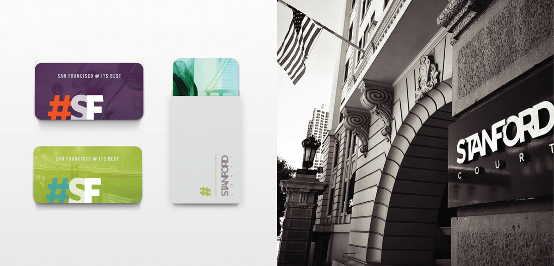
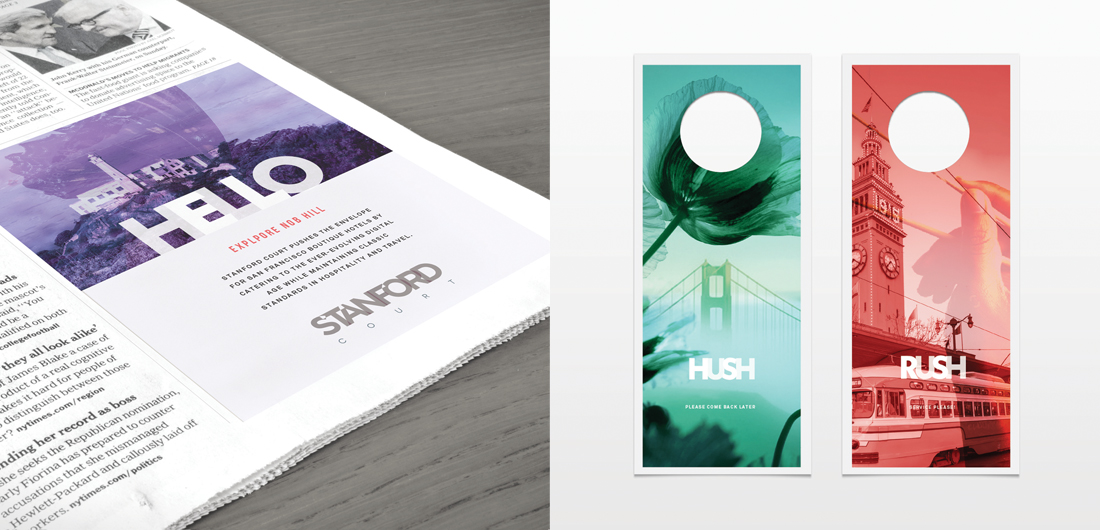
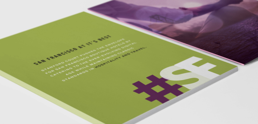
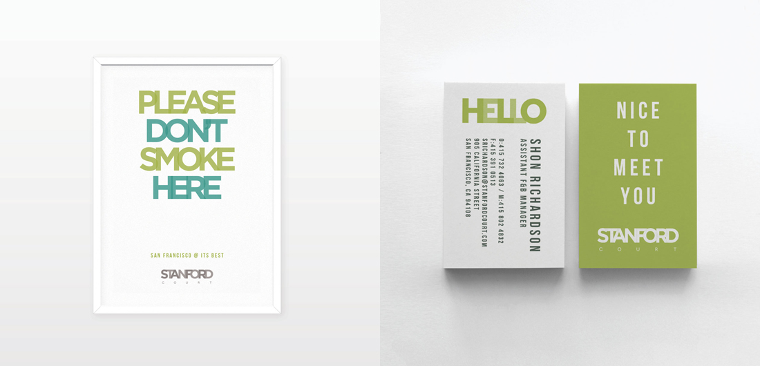
bold typography, double exposure photo with close-up of poppies and wide shot of Golden Gate Bridge in SF rounded corner hotel key cards and sleeve packet with cool typography, hotel brand naming, building logo sign hotel ad in newspaper, hospitality marketing, print collateral, creative do not disturb signs by branding agency California hotel brand collateral design with bold color palette and hashtag graphic by creative services agency no smoking poster sign with overlapping text typography in vivid jewel tones, modern hotel business card design

Stanford Court

Strategy, Branding, Brand Identity, Art Direction, Collateral Design & Production

This is a hotel that we’ve had the privilege of branding in 2013 and later refreshing it in 2017. Initially we wanted an edgy, interesting logo that matched the hotel’s eclectic qualities on Nob Hill, so the overlapping text worked well with a muted blue and beige palette. Modern, sophisticated and cool, the hotel welcomed many guests in tech, so we merged the text vernacular with a fun tone of voice. In 2017, we added vivid jewel tones and a fresh photographic point of view that features a unique perspective – merging an iconic SF destination with a close-up subject or personal experience.

Category

Hotels